Portfolio
Data Analysis - Larger projects
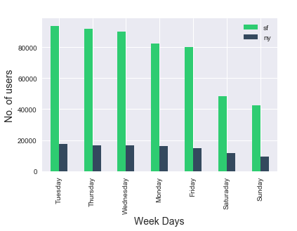
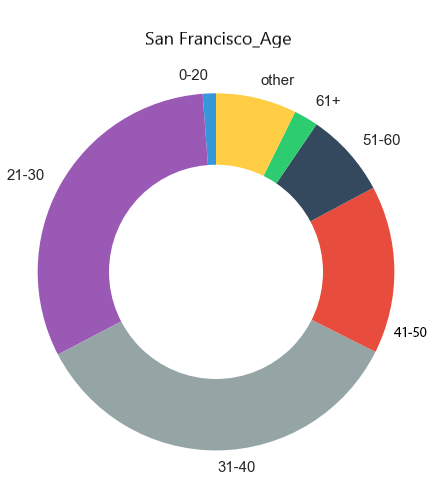
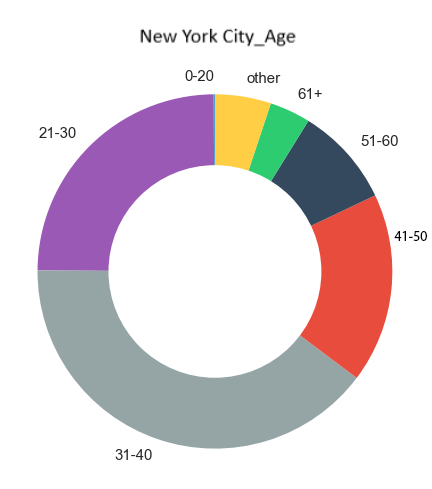
Group Project - NYC & SF Bike-Share Analysis
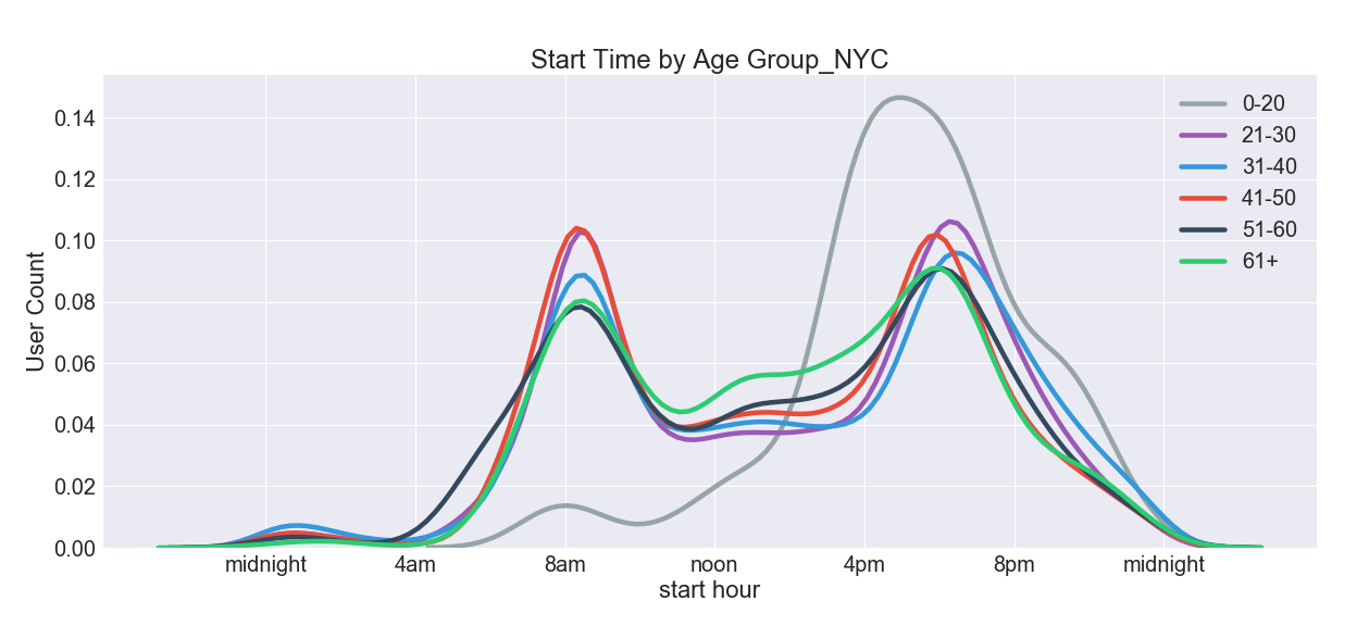
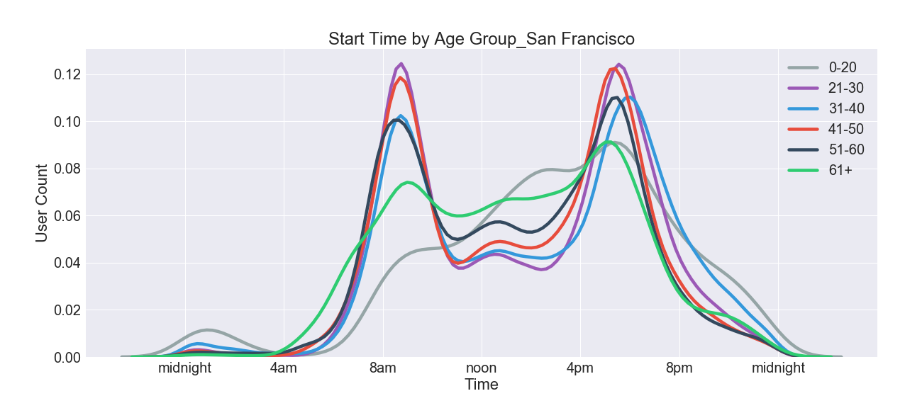
Background: As a group we analyzed the city-wide bike share programs in New York City and San Francisco, individually then comparing them to each other. Due to limitations we were only able to take a six-month snapshot of the data that was available. The time period we looked at included some winter months and given that New York experiences more of a winter than California that skews the data some, making it appear as though San Francisco has a much higher usage rate than New York City which is not accurate. While total numbers may be off for each location we believe that we are still able to identify trends in the both peak usage times and the type of rider most likely to use the service.
Process: Our data was available online and I downloaded each month for each city individually. Despite them coming from the same source there was a bit of cleaning up of the files that had to be done so that they could all be joined together. The column headers did not match and how gender was indicated differed between cities, as examples. I joined them all into a Pandas DataFrame then broke them out into age group bins and by city to make further analysis easier. I relied heavily on Pandas for analysis of the data and used Matplotlib, Plotly and Seaborn libraries for the data visualizations.
Conclusions: Some high-level observations included:
- General age of the rider: 36
- Males make up significantly more than half of all riders
- Peak usage hours are during work rush-hours, with evening being slightly more popular than the morning time
- Most frequently used stations for starting/ending a ride
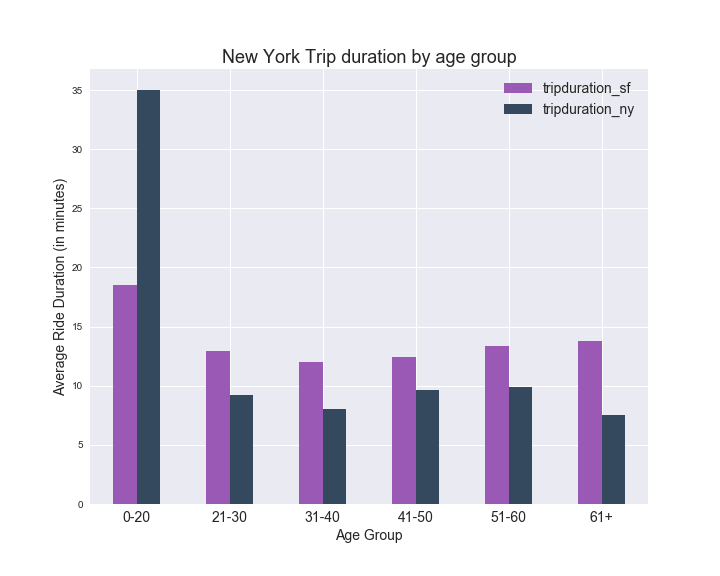
- Average trip duration
Visualizations
click image to enlarge
Partner Project - Denver Flight Data
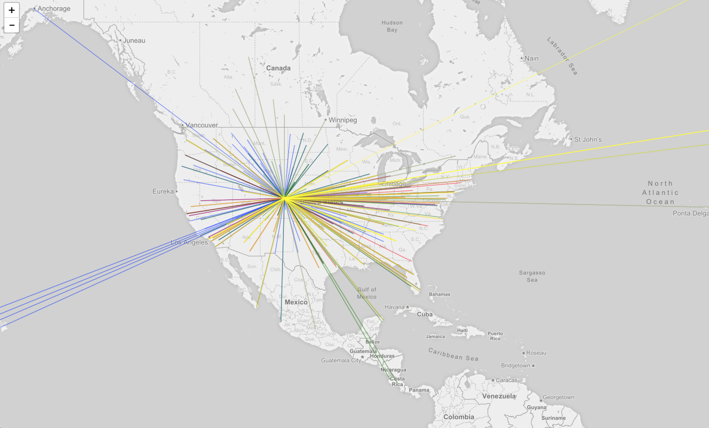
Background: We pulled a series of datasets from OpenFlights on airline, airports and routes, then creatively figured out how to merge them together into one dataset allowing us to create a map of flight routes, by airline. To reduce the amount of data we were dealing with we decided to limit it to only flights originating from Denver. The biggest challenge in this portion was mainly related to getting an accurate dataset to work with. The individual datasets had similar columns and codes but they were used differently across the data and keeping origin airport and destination airport separate throughout the process took precision.
The other main piece of this project included featuring a user-driven search of current flight deals. It is designed for the flexible travel who wants to see what deals are available in a given month. Enter the city code of departure, the month of travel and the country you'd like to travel to and a list of deals is returned in a javascript-driven table. The challenge in this piece of the project was scraping and filtering SkyScanner website. An API made the scraping easier however every possible destination in the database was returned whether flying there was an option or not. To resolve this we had to filter the returned data based on whether there was an image URL included (because only valid destinations included an image on the website) then further by direct and multi-stop pricing criteria.
Both pieces are compiled onto a website running with Flask
Process: We used Pandas to clean and merge the datasets and export to geoJSON data so we could graph it. Using Leaflet.js we created a multilayer map graphing the top few airlines' routes/destinations, and also breaking it down to domestic/international, and adding a pop-up giving the name of the airport.
Final Project - Running Across America
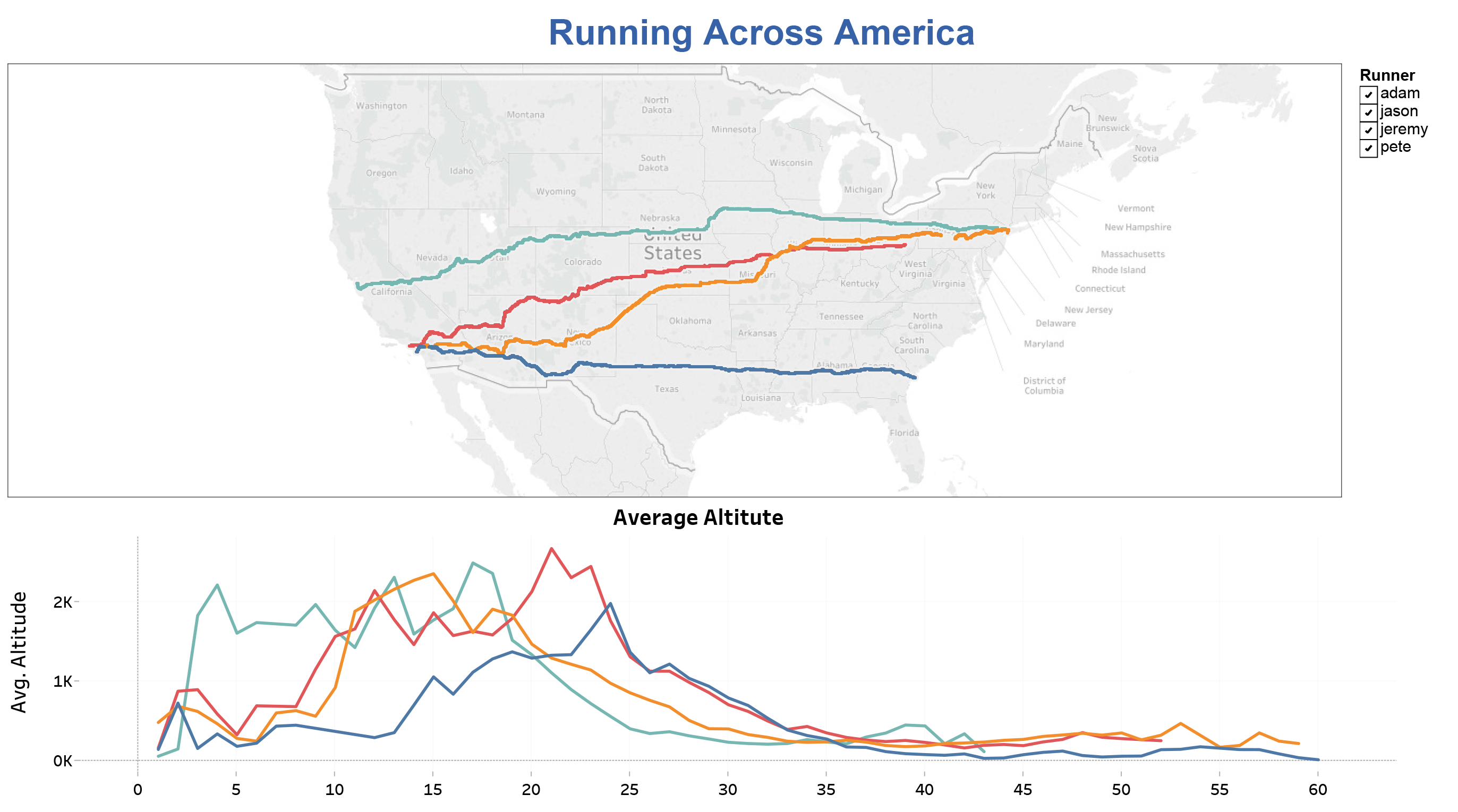
My Running Across America project focused on data from four athletes that ran across the United States in 2016. All of the data was pulled from Strava.com a social network site for fitness enthusiasts. Using Selenium and BeautifulSoup I scrapped the website for each runner pulling GeoJSON data, pace, duration, distance and date of run. The set-up of pages and varied slightly for each runner so I had to have four versions of the scrape code, one file for each runner. I continued to work with each runner individually while I cleaned the data, and filtered down to just the data relevant to their run across America. Working with the JSON data I ended up with over one million rows of data in total. In running calculations on this data, I was finding that my results were not matching the data that was showing on Strava’s website and I knew the results I was returning for average pace just didn’t seem right, even though the math/formula was. The JSON data included points for every time the runner’s watch pinged GPS so approximately every four seconds. I believe Strava’s algorithm is more advanced and able to eliminate data points for when the runner was stopped or other erroneous data, that could be affecting the accuracy of my results. Frustrated with this inaccuracy I decided to scrape Strava again, this time using their front-facing website, rather than accessing the JSON data. One difficulty I ran into with this method was my results included other people’s run data. Since Strava is a social network other people are able to share their runs on other people’s pages. I had to find a way to eliminate this data. I also had Garmin data from one of the runners which provided me a little more in-depth information so I did further analysis on just his run. I kept this data separate from the Strava data, because even though Garmin uploads to Strava the data between the two did not seem to match.
Once I had data I was satisfied with I moved into Tableau to create visualizations comparing the four runners and their routes, average pace, distance and time. Using the GeoJSON information I retrieved from Strava I was able to plot their four routes, which in my opinion is one of the most interesting aspects. Along with that I compared altitude, average pace, total duration and total distance run per day. All of these visualizations are controlled by one global filter so you can view just one runner at a time. Some of my further analysis on Jason included comparing elevation and temperature to his average pace as well as table to filter his top five runs, filtered by each variable.
The final piece of my project included an attempt at machine learning. I used the Random Forest method to predict the total distance given the variables of duration, runner and average pace. This turned out to be approximately 96% accurate, predicting within 2.4 miles of actual. As expected, total duration of the run has the greatest impact on the total distance of the run. How many days the runner was in to their run, had very little impact on their total distance. All of these runners were very consistent in their pace and distance run each day. In another formula I attempted to predict the runner based on randomly selected data. This set of data was not optimal for machine learning since it was all very consistent and also not a very good representation of typical running.